Responsive Website Design
Having a website that responds to whatever device the user is on, is no longer a luxury, it’s a necessity anymore – it’s expected. We’ll help you create an online user experience that has people fall in love with your brand and buy your stuff.
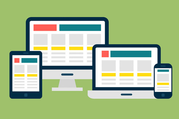
What Is Responsive Design?
Responsive web design is a style of web development where both the layout and the content responds to the device on which it is being rendered and the size of the screen it is presented on. If you're viewing this article on a desktop browser, for example, try making your browser window smaller. The content column will shrink and the placement of the text will adjust. On our homepage, you'll see the image sizes adjust and the layout shrink from three columns, to two columns, to a singular column of content.
Responsive web design is not only about adjustable screens and automatically resizable images, but rather about a whole new approach to web design. Given the rapid adoption of tablets and smartphones, web designers and developers want to eliminate the need for a different design and development phase for each new device. The solution is to build one site that has the ability to adapt to all devices..
Why do you Need a Website?
- Your website is your global face what makes your presence felt worldwide.
- Your website makes you competitive to beat the heat of cut throat competition.
- You explore opportunity to promote your services/products on the internet ( the most economical way to expend your wings to boundary-less world.)
- Your potential customers may know the full extent of your service/product offering
- Your customers will get answers to their business related queries from one place and that too from horse’s mouth
- You can make presence felt 24X7.
All these mean that you are gaining great potential business.
At Zksolutions we truly comprehend web sites - we don’t want to confuse you in complicated technical jargons but try our level best to gain your confidence by explaining everything to you clearly in an easy language that we will be able to develop an optimum web site to meet the needs of both you and your customers. Our existing customers are our brand ambassadors who reflect our success and our consistent passion to produce unbeaten solutions. Our sole goal is to see you on zenith of success and our success is an inherent part of yours.
Contact us today to join the band wagon of success as time never bounces back.